文章欢迎转载,转载请注明出处:文章首发于【Karen Chia の 程序人生】RecyclerView系列 - 如何优雅的实现分割线

在这里插入图片描述
效果图不是我想要的效果,怎么办?

查看关于 RecyclerView 系列的其它文章,总有你想要的效果 ↓↓↓

KarenChia 的 RecyclerView 系列文章

RecyclerView系列 - RecyclerView的基本使用

RecyclerView系列 - 如何优雅的实现分割线

前言

在 RecyclerView 系列文章中,上一篇我们说到了 RecyclerView 的基本使用,期间提到了 RecyclerView 自身是不能设置分割线的,需要自行设置。本篇文章将从不同的“视角”讲解 RecyclerView 分割线的设置方法,文章建立在上一篇文章【RecyclerView系列 - RecyclerView的基本使用】的基础上,如果需要了解 RecyclerView 的基本使用、布局管理器的设置、数据适配器的设置等,请自行查看【RecyclerView系列 - RecyclerView的基本使用

1 RecyclerView 分割线设置方式一

更改列表子项 item 布局

这种方式设置的其实不是 RecyclerView 组件的分割线,只是更改了 item 的布局文件,在视觉效果上达到了分割线的效果。

item 的布局文件如下:

<?xml version="1.0" encoding="utf-8"?>
<LinearLayout xmlns:android="http://schemas.android.com/apk/res/android"
android:layout_width="match_parent"
android:layout_height="wrap_content"
android:background="@android:color/white"
android:orientation="vertical">

<TextView
android:id="@+id/tvData"
android:layout_width="wrap_content"
android:layout_height="wrap_content"
android:layout_margin="10dp"
android:textColor="@android:color/black" />

<View
android:id="@+id/viewDivider"
android:layout_width="match_parent"
android:layout_height="1dp"
android:background="@android:color/holo_red_dark" />
</LinearLayout>

这里在原有文件的基础上,新增了 View 组件,用于实现视觉效果上的分割线。

可设置水平分割线的高度及颜色,更改 View 组件的相关属性即可。

这样的设置方法,在列表的最后一项是带有分割线的,需要在 adapter 的数据与视图进行绑定的方法中,控制 View 组件的显示与隐藏:

/**
* 将数据与 item 视图进行绑定
*/
@Override
public void onBindViewHolder(@NonNull RecyclerViewTestViewHolder holder, int position) {
//最后一项 item 不显示分割线
if (position == testDataList.size() - 1) {
holder.viewDivider.setVisibility(View.GONE);
} else {
holder.viewDivider.setVisibility(View.VISIBLE);
}
holder.tvData.setText(testDataList.get(position));
}

2 RecyclerView 分割线设置方式二

使用 Android 自带的分割线

RecyclerView 提供了 addItemDecoration(@NonNull ItemDecoration decor) 方法,可用于设置系统默认分割线

public void addItemDecoration(@NonNull ItemDecoration decor) {
addItemDecoration(decor, -1);
}

给 RecyclerView 添加分割线

rvTest.addItemDecoration(new DividerItemDecoration(this, DividerItemDecoration.VERTICAL));

这里的 DividerItemDecoration 采用的是 RecyclerView 组件的背景色

<?xml version="1.0" encoding="utf-8"?>
<LinearLayout xmlns:android="http://schemas.android.com/apk/res/android"
android:layout_width="match_parent"
android:layout_height="match_parent"
android:background="@color/app_bg"
android:orientation="vertical">

<androidx.recyclerview.widget.RecyclerView
android:id="@+id/rvTest"
android:layout_width="match_parent"
android:layout_height="match_parent"
android:background="@android:color/holo_red_dark" />
</LinearLayout>

在这里插入图片描述
采用这种方式设置的分割线的高度是系统默认的,我们无法修改分割线的高度。

为了方便修改分割线的高度、颜色,DividerItemDecoration 类提供了 setDrawable() 方法,供开发者自定义分割线。
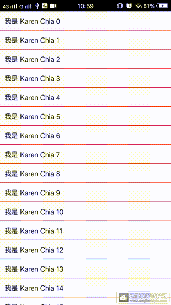
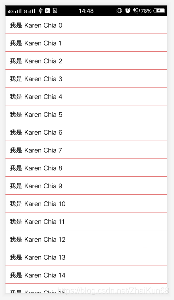
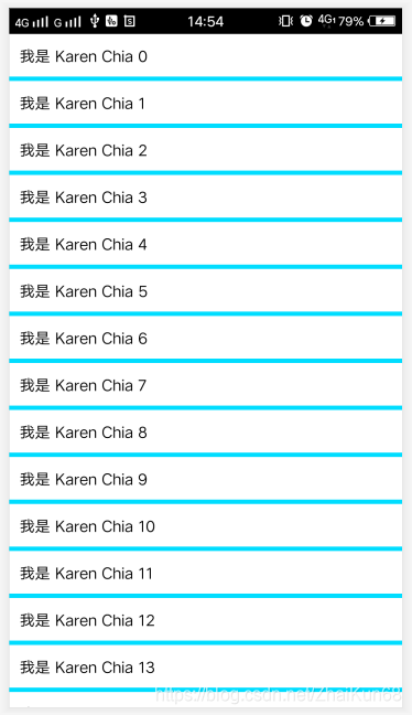
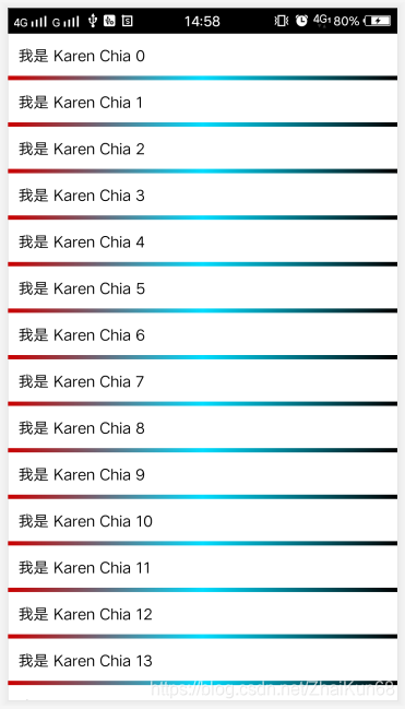
/**
* Sets the {@link Drawable} for this divider.
*
* @param drawable Drawable that should be used as a divider.
*/
public void setDrawable(@NonNull Drawable drawable) {
if (drawable == null) {
throw new IllegalArgumentException("Drawable cannot be null.");
}
mDivider = drawable;
}

新建 Drawable 资源文件:

<?xml version="1.0" encoding="utf-8"?>
<shape xmlns:android="http://schemas.android.com/apk/res/android"
android:shape="rectangle">
<solid android:color="@android:color/holo_blue_bright" />
<size android:height="4dp" />
</shape>

为 RecyclerView 设置自定义的分割线样式:

DividerItemDecoration dividerItemDecoration = new DividerItemDecoration(this, DividerItemDecoration.VERTICAL);
dividerItemDecoration.setDrawable(getResources().getDrawable(R.drawable.shape_recycler_view_divider));
rvTest.addItemDecoration(dividerItemDecoration);

在这里插入图片描述
稍微复杂一点的,可以为分割线定义渐变色,修改 Drawable 资源文件:

<?xml version="1.0" encoding="utf-8"?>
<shape xmlns:android="http://schemas.android.com/apk/res/android"
android:shape="rectangle">
<gradient
android:centerColor="@android:color/holo_blue_bright"
android:endColor="@android:color/background_dark"
android:startColor="@android:color/holo_red_dark" />
<size android:height="4dp" />
</shape>

在这里插入图片描述

3 RecyclerView 分割线设置方式三

利用 item 与 RecyclerView 之间的 Margin,达到显示分割线的效果,分割线的颜色为 RecyclerView 的背景色。

在 RecyclerView 适配器中的 onCreateViewHolder()方法中,加载 item 布局时进行设置:

/**
* 加载 item 的布局文件
*/
@NonNull
@Override
public RecyclerViewTestViewHolder onCreateViewHolder(@NonNull ViewGroup parent, int viewType) {
View view = LayoutInflater.from(mContext).inflate(R.layout.item_recycler_view_test, parent, false);
RecyclerView.LayoutParams layoutParams = (RecyclerView.LayoutParams) view.getLayoutParams();
layoutParams.bottomMargin = 10;
view.setLayoutParams(layoutParams);
return new RecyclerViewTestViewHolder(view);
}

在这里插入图片描述

4 RecyclerView 分割线设置方式四

在之前提到的使用 Android 默认的方式来设置分割线的方法中,可以看到 DividerItemDecoration 类继承了 RecyclerView.ItemDecoration,那么我们也可以继承 RecyclerView.ItemDecoration,从而实现自己的分割线。

先看下源码:

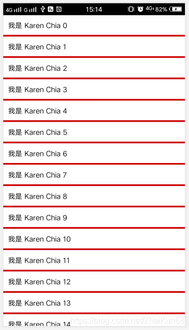
/**
* An ItemDecoration allows the application to add a special drawing and layout offset
* to specific item views from the adapter's data set. This can be useful for drawing dividers
* between items, highlights, visual grouping boundaries and more.
*
* <p>All ItemDecorations are drawn in the order they were added, before the item
* views (in {@link ItemDecoration#onDraw(Canvas, RecyclerView, RecyclerView.State) onDraw()}
* and after the items (in {@link ItemDecoration#onDrawOver(Canvas, RecyclerView,
* RecyclerView.State)}.</p>
*/
public abstract static class ItemDecoration {
/**
* Draw any appropriate decorations into the Canvas supplied to the RecyclerView.
* Any content drawn by this method will be drawn before the item views are drawn,
* and will thus appear underneath the views.
*
* @param c Canvas to draw into
* @param parent RecyclerView this ItemDecoration is drawing into
* @param state The current state of RecyclerView
*/
public void onDraw(@NonNull Canvas c, @NonNull RecyclerView parent, @NonNull State state) {
onDraw(c, parent);
}

/**
* @deprecated
* Override {@link #onDraw(Canvas, RecyclerView, RecyclerView.State)}
*/
@Deprecated
public void onDraw(@NonNull Canvas c, @NonNull RecyclerView parent) {
}

/**
* Draw any appropriate decorations into the Canvas supplied to the RecyclerView.
* Any content drawn by this method will be drawn after the item views are drawn
* and will thus appear over the views.
*
* @param c Canvas to draw into
* @param parent RecyclerView this ItemDecoration is drawing into
* @param state The current state of RecyclerView.
*/
public void onDrawOver(@NonNull Canvas c, @NonNull RecyclerView parent,
@NonNull State state) {
onDrawOver(c, parent);
}

/**
* @deprecated
* Override {@link #onDrawOver(Canvas, RecyclerView, RecyclerView.State)}
*/
@Deprecated
public void onDrawOver(@NonNull Canvas c, @NonNull RecyclerView parent) {
}


/**
* @deprecated
* Use {@link #getItemOffsets(Rect, View, RecyclerView, State)}
*/
@Deprecated
public void getItemOffsets(@NonNull Rect outRect, int itemPosition,
@NonNull RecyclerView parent) {
outRect.set(0, 0, 0, 0);
}

/**
* Retrieve any offsets for the given item. Each field of <code>outRect</code> specifies
* the number of pixels that the item view should be inset by, similar to padding or margin.
* The default implementation sets the bounds of outRect to 0 and returns.
*
* <p>
* If this ItemDecoration does not affect the positioning of item views, it should set
* all four fields of <code>outRect</code> (left, top, right, bottom) to zero
* before returning.
*
* <p>
* If you need to access Adapter for additional data, you can call
* {@link RecyclerView#getChildAdapterPosition(View)} to get the adapter position of the
* View.
*
* @param outRect Rect to receive the output.
* @param view The child view to decorate
* @param parent RecyclerView this ItemDecoration is decorating
* @param state The current state of RecyclerView.
*/
public void getItemOffsets(@NonNull Rect outRect, @NonNull View view,
@NonNull RecyclerView parent, @NonNull State state) {
getItemOffsets(outRect, ((LayoutParams) view.getLayoutParams()).getViewLayoutPosition(),
parent);
}
}

ItemDecoration 类包含了三个主要的方法:onDraw()、onDrawOver()、getItemOffsets()